
City of Hope’s logo could be enhanced with thoughtful refinements, strengthening its identity in cancer research while maintaining its core image. These design improvements can emphasize the organization’s focus on patients, with a refreshed icon that more accurately represents their practice and mission.


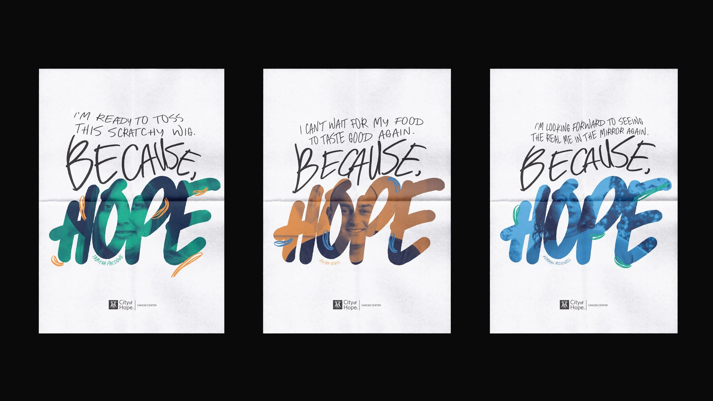
City of Hope is one of the largest and most advanced cancer research and treatment organizations, with a uniquely integrated model that spans cancer care, R&D, academics and training. City of Hope innovates treatments and delivers advanced care from lab to patient quickly, since all work happens under one roof. The two directions (Hope is Vital & Because, Hope) explored address the challenges:
Awareness and name
City of Hope’s Government Affairs team has to re-introduce themselves to policymakers before getting into the issues. “City of Hope” could mean anything in the nonprofit/healthcare space.
Big-name competition
Other cancer care centers are better-
known, more household names.
Funding
As government funding gets slashed, City of Hope needs to demonstrate the life-saving value of your model, care and research.